A strong rebrand that stands tall in a field of competition
Overview
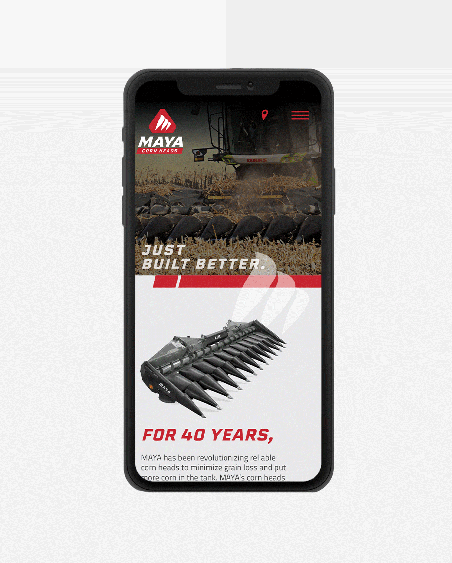
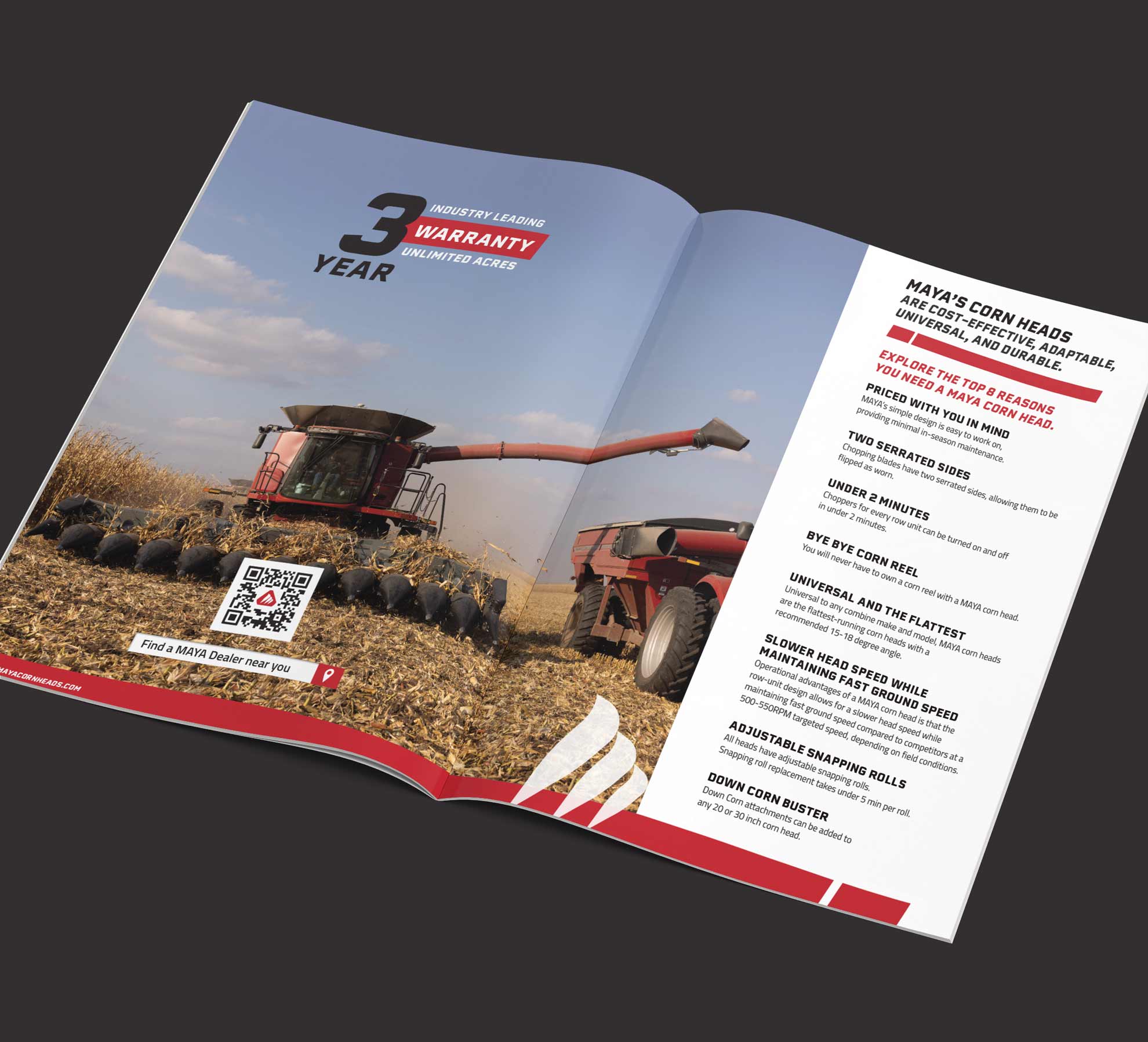
For 40 years, MAYA has been revolutionizing reliable corn heads to minimize grain loss in the field and putting more corn in the tank. Ready to take their company to the next level, enhancing the company branding was step one in a multi-phase approach focused on brand awareness. The goal was to simplify their current logo, keeping the corn head shape and giving it a more aggressive stance, more in line with the productivity of MAYA, while keeping a subtle “M” shape.
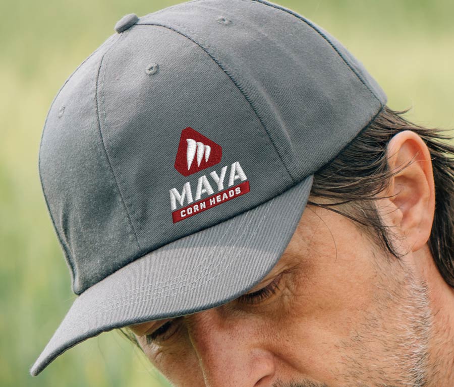
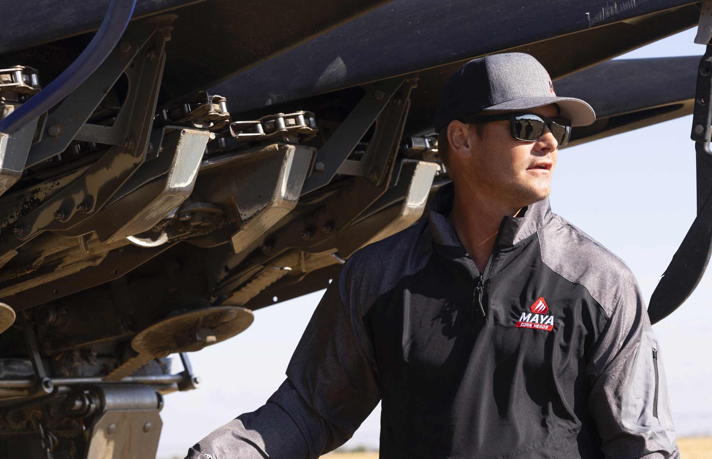
The new icon works well on its own, confident and easily identifiable with the growth of MAYA in the US market moving forward.
Results
The result was a strong, bold logo emphasizing that MAYA Corn Heads are built better. MAYA has branding that stands out amongst its competitors and will be the foundation of becoming a household name in the corn harvesting sector of crop farming. To ensure uniformity in branding and messaging, a brand guide was created to reference for future use as the marketing efforts of MAYA expand.